Nora Roberts is a huge author (obviously) in the US. Is she as big in the UK? I don't know, but her publishers can probably afford to make as many different covers as they want for her books. I prefer the US cover on this one.

Northern Lights US Cover

Northern Lights UK Cover
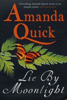
Here is another big romance book. Naked man's chest on the US version, butterfly on the UK. I also prefer the US cover here.

Lie By Moonlight UK Cover
Lie By Moonlight US Cover
For Camelot's Honor is a Luna book. It is presented more as a historical novel in both of these covers. "Honor" is spelled differently, but that is a normal American/British difference. I love the UK cover here.

For Camelot's Honor US Cover

Camelot's Honour UK Cover
Haunted is a book I was a little surprised to see a different cover on. I have noticed that most books that are published as mass market paperbacks seem to stick with the same covers. Probably a cost issue. But this one has different art. It also has a different tagline. Seems like it relies on sex less to sell it (as on the Quick book above as well). I prefer the US edition.

Haunted US Cover

Haunted UK Cover
Seduced by Moonlight is the latest from an author who has become huge in the US. Hamilton definitely sells sex, and her covers show it, even in the UK. Only a few differences really -- the addition of the rose, and the print is larger. The UK edition has a slight edge for me here.

Seduced by Moonlight US Cover

Seduced by Moonlight UK Cover
Stephen King's publishers, like Nora Roberts' can afford multiple covers. Here, the US covers sells the western feel and Roland as the main character. The UK cover seems more bleak, but also more focused on the tower as the center of the universe. I can't decide here. I like both for different reasons.
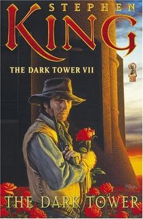
The Dark Tower US Cover

The Dark Tower UK Cover
Different covers appear on mystery titles as well. The US cover of Ricochet is kind of plain. The UK edition has more going on. The US cover uses red, like the book is screaming "somebody dies in this book!" I like the UK cover.

R is for Ricochet US Cover

R is for Ricochet UK Cover
Even a book as big as The Da Vinci Code can have a different cover put on it, which surprised me because I thought that the cover had a certain recognition factor at this point. I guess that didn't extend to the UK. The UK cover has more of a historical feel. I like it, but I don't know if it fits.

The Da Vinci Code US Cover

The Da Vinci Code UK Cover
Different cover occur on non-fiction books as well. Here, even the title is slightly different. The US cover focuses more on Napoleon, and the UK cover focuses more on the cold climate of Russia that destroyed him. I like both of them.

1812 US Cover

1812 UK Cover

So what do you guys think? Do you notice these differences like I do? Which do you prefer?

4 comments:
Oooh, my favourite topic! I had planned to post UK/US covers of category romances and other covers, but you got there first. And frankly, I'm glad because I found your comments interesting. :D
I'm quite mortified that - at a glance - I prefer almost all UK covers. I'll have another look. :D
Nora Roberts - I love the US cover [or rather, the image], but dislike the size and typeface. I prefer the typeface on the UK cover, but the use of image is f. dull [Piatkus has a tendency to go for images of generic landscape when peddling books by Linda Howard, Nora Roberts and, I think, Jayne Ann Krentz]. If I had my way, I'd use the UK typeface and size on the image of the US cover.
There's no way I'd pick up Quick's book if the UK used the US cover. I definitely prefer the UK version.
Camelot's Honour - if I were to buy a copy, the UK gets my vote, even though the US is a lot warmer [and dramatic] than the UK cover.
Armstrong's HAUNTED - the UK cover gets my vote [even though this is my least favourite of UK covers of Armstrong's books]. The US cover reminds me of those covers of occult novels that dominated the 1970s, e.g. Dennis Wheatley. You still see those books in every charity shops. It's, for me, associated with 1970s and sleaziness.
LKH's SEDUCED BY MOONLIGHT - hm ... neither gets my vote. I like the image on the US cover, but overall, it doesn't do a thing for me. UK cover is hum ho.
The US cover of Stephen King's DARK TOWER is very American,and I'm not sure I'd pick it up if it was used over here. The UK cover [of the reissue?] seems to me is an attempt to attract LORDS OF THE RING fans. I prefer the original UK cover.
The US *and* UK covers I liked least of the slate on your blog is Sue Grafton's RIFR. Both don't attract me at all.
Dan Brown - I have no set preference, but I do find that I'm attracted to the UK version. I find it interesting that you view this as 'historical feel', which I don't see. I took it as an 'academic feel'. The US version seems very American to me, I have no idea why, though. I think it's the size? I don't know, really.
1812 - No set preference. I love the US cover because of the picture and the warmth it emits, but it looks awkwardly laid out, which had me preferring the UK cover, even though I found it 'cold'.
Thanks for giving me a chance to natter! :D
Well, here's my Midwestern opinion. I like the UK versions on all of them except the Amanda Quick one (and even that one's iffy. I'm sick of half-naked people on covers and I'm NOT a prude). Definitely like the Da Vinci Code UK version, it seems like it fits better (even though I'm probably the last person who hasn't read it. People, stop buying it in hardback so it'll go to paperback like elsewhere in the world). I think the Haunted US cover is just plain ugly. I have For Camelot's Honor and think that the UK version captures the "feel" of the book better. The hawk and the angst, especially.
I'd say the UK covers too, except for the Nothern Lights and Amanda Quick covers which are REALLY boring. And, Nicole, I'll be right after you in reading the Da Vinci Code. Haven't had the urge to pick it up in any country.
I liked the UK covers for all titles except Lie by Moonlight. Neither Seduced by Moonlight cover appealed to me, but for everything else, I prefer UK.
Perhaps this is a sign I should consider a move to the UK . . .
Alyssa
Post a Comment