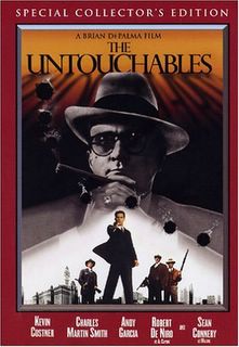
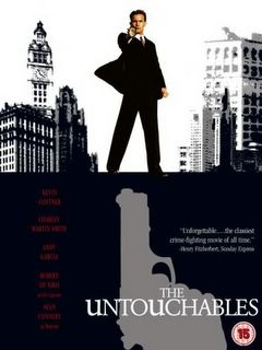
The Untouchables: The same picture of Kevin Costner is used, but the UK version cuts out Al Capone. I think I prefer the UK version, which seems more stylish. The gun silhouette seems more like something you'd see on a James Bond movie though.
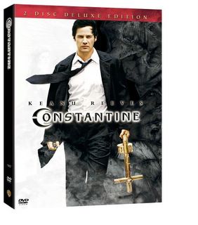
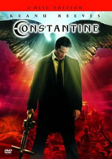
Constantine: I've seen two different versions of the UK cover -- the other one used the same picture of Keanu Reeves. I like the black and white sides of the US version, but I think I prefer the UK version with the angel wings. Wish I had that one.
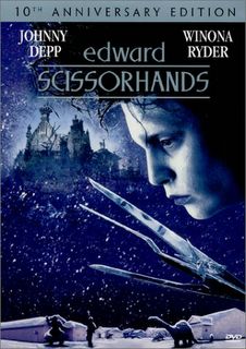
Edward Scissorhands: Very little difference here. So little that I wonder why they even bothered. The picture has just been flipped. I like the US cover where the colors are more vibrant.

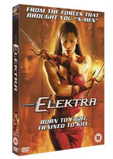
Elektra: Same picture, different background. I kind of like the "Born to Fight. Trained to Kill." blurb on the UK cover.

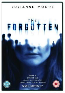
The Forgotten: The UK cover is more mysterious. The US cover seems to focus more on the star, which doesn't surprise me, because in the US the star often seems to be treated as the most important part of a movie.

House of Flying Daggers: Great movie, btw. I like both covers. I think if I had the choice, I'd probably pick the US one. I think the choice of such a different cover design is interesting. the US one seems to focus more on the battle/action sequences, whereas the UK one has more of a historical feel to me.


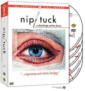
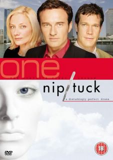
Nip/Tuck: When this US cover appeared, I immediately hated it. If anything, one of the images from the credit sequence at the beginning of the show would have been nice. The UK version is so much better.
Ray: The US cover has more of a blues/jazz feel to me. I like the UK cover, but I guess I've seen the US poster art so long that anything else just doesn't feel right.


Shaun of the Dead: I like the US cover because it includes his friend and his girlfriend on the front. And because it has Shaun in his uniform. And I love the blurb on both.


The Terminal: I like the UK cover because it makes more of the airport setting. Looking at the cover, you automatically know what kind of terminal is being referred to. And I like the blurring of all the people around him, emphasizing the constant change.


3 comments:
what is the number in the circle on the bottom of the covers?
BBF [British Board of Film] certifications, e.g. age ratings.
BTW, I think you'll like this web site: Internet Film Poster Awards :)
P.S. the correct/current acronym is BBFC, but the organisation is changing from 'certifications' to 'classifications', hence me spelling it out. :)
Ok, I feel better now I have it off my chest. :D
Thanks, Maili, wondering was driving me crazy! That's actually pretty convenient and easy for people concerned with such things.
And that website is awesome! Lots more posters for me to add. It's actually hard to find good websites that round up movie posters, so every new one is great.
Post a Comment