How often do you see changes in cover art before they hit the shelves? I know it is standard practice a lot of the time to change cover art between a hardcover and a paperback, frequently because the consumers vary between the two formats, or because the cover art might be decided to be stale or a bad fit for the different size. It's also standard to change cover art for different editions (how many different version of LOTR can there be?). But how often do you just see a complete revamp of cover art for one edition?
Crazy Hot and Crazy Cool: You've probably all seen these by now, but they still shock me when I look at them. I really can't believe that this cover art was changed. I really like the original art (on the left). I think the art on the right (and presumably, what we will see on the shelves) is boring and ugly. Seems like they are trying to go for a less-romance, more chick-lit James Bond feel, probably with a hope for a more mainstream audience. Which I am fine with, but can't it be done with nice cover art?


How to Marry a Millionaire Vampire: I posted the original cover a couple of weeks ago, but I recently noticed that there is a new cover up at Amazon.com. A very, very different cover. The first cover is more playful, emphasizing that the book is humorous. The second is a complete departure. The covers make these seem like two totally different books. The title is obviously humorous or satirical, but the new cover, the one on the right, doesn't really look like it would be humorous at all. Are they trying to confuse me?


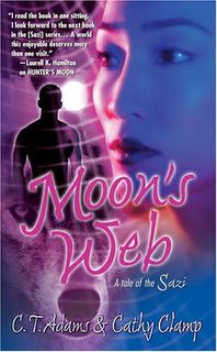
Moon's Web: Just saw this new cover today. The web and wolf motif stayed, but I think it's interesting that the dynamics of the couple were changed. In the original, they are together -- implying that they are united against whatever threat/mystery they are faced with. But the newer cover, on the right, shows the heroine in the foreground and the man as a shadowy presence. Seems like a totally different kind of story. And am I the only one who noticed that the couple isn't black anymore? Did the publisher decide that people won't buy the book if the couple on the cover is black?


How to Marry a Millionaire Vampire: I posted the original cover a couple of weeks ago, but I recently noticed that there is a new cover up at Amazon.com. A very, very different cover. The first cover is more playful, emphasizing that the book is humorous. The second is a complete departure. The covers make these seem like two totally different books. The title is obviously humorous or satirical, but the new cover, the one on the right, doesn't really look like it would be humorous at all. Are they trying to confuse me?


Moon's Web: Just saw this new cover today. The web and wolf motif stayed, but I think it's interesting that the dynamics of the couple were changed. In the original, they are together -- implying that they are united against whatever threat/mystery they are faced with. But the newer cover, on the right, shows the heroine in the foreground and the man as a shadowy presence. Seems like a totally different kind of story. And am I the only one who noticed that the couple isn't black anymore? Did the publisher decide that people won't buy the book if the couple on the cover is black?


6 comments:
These are too cool. Hmmmm, I never can get my blipping covers changed.
It definitely seems like they are going for a series/branding look for the Janzen books. I agree that while it might appeal to a more mainstream audience, it's ugly.
I hadn't really looked at the models on the Moon's Web cover before, but you are right: although the woman is Asian-looking, they completely took any suggestion of the hero's color away. Sigh.
I don't care so much about the covers of the Janzen books. I just want the damn things published!!! I've been waiting with such bated breath for another book by her ever since River of Eden that I'm getting dizzy from not breathing. First there was the name change (from Glenna McReynolds) then the cover change. Just publish them! And just for the record, I like the first cover better too.
Meljean -- I thought the original Janzen covers had a pretty good "brand" look. And I think it's great that the cover model is Asian (makes me want to read it), but I'm still disappointed in the change.
Kristie -- I am with you on being tired of waiting for these books. I hope they live up to the wait.
cw -- I still have the first on my TBR pile. I know I will read it eventually, because I've heard it's one of the better books in the new Tor line, but it also hasn't been jumping at me.
Wow the new cover for Kerrelyn Sparks changes everything. If I came across the new cover in a store I'd keep on walking, because even with the title, the cover looks too dark to me. I see it and think Interview with a Vampire not Young Frankenstein.
Post a Comment