Personally, I can't stand them. To publishers and authors I say: I don't buy them. I see these covers online and at the store, and I usually skip right past them. The authors I read frequently aren't usually stuck with clinch covers. That's probably partly because of the type of books I read (often cross-genre) and partly that I avoid certain publishers who specialize in clinches. I know I'm not the only reader who avoids these covers.
So yes, they may be selling their books to the people who like clinches, but they are also missing out on sales to large-volume readers who don't like them. They are also missing out on the library market. There are still a lot of libraries and librarians who don't buy romances. And part of that can be blamed on clinch covers and the bad image that they have and that they convey.
Readers who like the clinch covers are a different issue. Obviously, everyone has different tastes and everyone has different ideas about things. But the clinch covers propogate the very views of romance that we frequently fight against or are frustrated with. If you don't want someone to deride your romance reading, why are you holding a book that just begs for derision? And why, when women complain all the time about men objectifying women, do we paste pictures of half naked men in typically phallic, patriarchal images on the covers of our books? And why, when women complain all the time about the unrealistic expectations and images of beauty out there, do we put typical white, slim, big-breasted, same-old-same-old women on the covers of our own books?
I would like to see the clinch disappear. But since I don't think that's going to happen anytime soon, I wish publishers would stick to the compromise that is sometimes applied to books: Put the clinch picture on a stepback and have a classy front cover. Don't put the clinch on the back of the book, because that's equally as visible and irritating as the front, if not more so because sometimes I'm tricked into getting one when I buy books online. On the stepback, the people who want it can ogle it, and those of us who don't like it can ignore it or cut it out at our own choosing.
And in case you think I'm over-reacting to the continued presence of clinch or bodice ripper covers (and because I can't have a post without pictures), here are a few recent ones that I've seen:
April 2005
Avon

May 2005
Love Spell
July 2005
Avon

August 2005
Love Spell

April 2005
Leisure

March 2005
Avon

June 2005
Zebra

July 2005
Avon
March 2005
Leisure

June 2005
Avon

April 2005
Zebra

February 2005
Avon
June 2005
Love Spell

January 2005
Avon

May 2005
Avon

April 2005
Love Spell


10 comments:
Erk, I do dislike most clinch covers. Avon and Lovespell are the worst. Ugh.
Is Joy Nash a new author? I read about that book and it seemed interesting.
I had romance covers for the most part. Some are great but most of them make the books look like they deserve their rep.
I pretend they are not there.
Good grief! Some of these covers are just begging for cover snark a la the Smart Bitches.
Alyssa
Urgh. I don't like *any* of those covers.
I hate them all too. And I thought about adding snark, Alyssa, but I know I wouldn't be as clever as Candy and Sarah, so I figured you guys could do it for me.
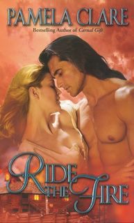
I do like one cover: Ride the Fire, though it might be because I like the colors.
Cover snark coming right up . . .
http://scrapseasons.blogspot.com/2005/06/couldnt-help-myself.html
Alyssa
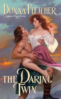
Oh no -- I just got stuck on the THE DARING TWIN one and can go no further!
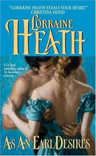
I have to admit, at times I don't mind a couple-on-the-cover...but I prefer to have it stepbacked (can I verb that word?) And maybe not so in-my-face. Of these, the Lorraine Heath seems the best--maybe because the clinch isn't taking up all of the cover? I'm not sure why.
Also, when Avon puts the clinch on the back of the book--for some reason, I like that better. Like the stepback, it's like I'm given a choice to take or leave the clinch (another not-in-my-face issue, I guess). I'm not inspired by the Avon back covers (they all look the same to me: pastel Regency-looking models standing close together by a gazebo or some crap like that) but I'm not taken aback by them, either.
Sad to say: I actually decided NOT to buy WHEN DASHING MET DANGER today (I have a weakness for the word 'dashing' for some odd reason), just because of that cover. I might get it later, but that cape...and that bare chest...*cries*
I like a well-done clinch.
There, I said - I feel better :)
For instance, I rather like Ride The Fire and the Lorraine Heath cover. And the author that pops into my head immediately is Nicole Jordan. She's had some great step-back clinch covers.
But yeah, some of those Avon and Leisure covers are horrid. Celtic Fire especially makes me want to cringe....
Sybil, I am pretty sure Nash is a new author (though you never really know with name changes). LoveSpell seems to be pretty open to new authors.
Wendy, the Heath and Clare covers are the best of the bunch, so I can see how you might like them. I also can't stand Celtic Fire, or The Daring Twin, but my least favorite is Stealing Sophie.
Well, now we know why fancy book covers were invented.
Post a Comment