Fingersmith by Sarah Waters: The picture on the UK cover is on the BBC production of the movie, which as far as I know is not available in the US as of yet. Why not? Because it's about lesbians in Victorian times. I've come across a lot of people who think such things just "didn't happen back then." I think it's sad that Americans can't handle subjects like this. Noticeably, glancing at the US cover, you wouldn't even know it's about lesbians at all.


The Historian by Elizabeth Kostova: Here's a book that's gotten a lot of notice and a lot of buzz for its debut in July. Reportedly, the author got 2 million for it, and it's already on the way to being made into a movie. The rich tones of the US cover imply the combination of vampire and historical, and the hint of a face is interesting, even if it is sideways. I like the font and the script on the UK cover though, and the drops of blood, which draw notice to the vampire theme.


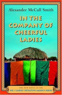
In the Company of Cheerful Ladies by Alexander McCall Smith: I have a few friends who love Smith's books. The UK cover looks more like it would be true to African folk art (though I have no idea whether it is or not). The US cover just seems so clean, it looks more like a beach resort.

Lifeguard by James Patterson: Okay, here's one I don't know why they changed. Both show a lifeguard's shed (what do you call it?). Do they have lifeguards in the UK? I really don't know. I've never lived near the beach. Are they significantly different from place to place. Also, one cover emphasizes the sand, and the other the sky. I like the US cover, it looks warmer.


Lost City by Clive Cussler: Okay, both have a submarine, and I prefer the one on the UK cover, but that design behind Cussler's name is distracting. Though I don't really like the plain black and white either. I don't really like either cover here.


Olympos by Dan Simmons: If I were to judge solely on the covers, I would think the US book was a fantasy, and the UK book a science fiction. Interestingly, Ilium and this sequel are a combination of fantasy and science fiction. Does sci-fi sell better in the UK? Is that why the emphasis on it more? I think fantasy is on an upswing more than sci-fi in the US.


Something Rotten by Jasper Fforde: Man, there is a huge difference between these two covers. If I were to go just on impressions, the UK cover has more of a humorous appearance that the US cover doesn't have. They both have books, and they are definitely both odd covers. I think I do prefer the US cover here.


Ten Men by Alexandra Gray: Okay, the first cover is of the US hardcover edition, the second of the US paperback edition, and the third of the UK edition. Obviously the publisher rethought the emphasis from the hardcover to the paperback edition, moving from showing multiple men to focusing on the heroine. But why the background difference between the US and the UK. I've heard that the most popular color for book covers published in the US is blue. Maybe blue doesn't sell as well in the UK.


The Traveler by John Twelve Hawks: These covers are probably the most different of the covers I've shown today. Traveler is also a book with a lot of buzz. Though at heart a sci-fi novel, it is being published by Random House's regular fiction imprint rather than by their Sci-fic imprint. They are obviously trying to find a mainstream audience for it. The UK cover has more of a sci-fi feel to it. Looking at the US cover, I wouldn't even guess that it was sci-fi, but I've heard it is supposed to be sort of like The Matrix. Oh, and why the different spelling on "traveler/traveller"?Is that the normal spelling in the UK. I guess I never noticed it before.


3 comments:
Fingersmith - I think the US cover was the original UK cover, but the UK cover didn't have the green bar at bottom. It's interesting to note that the US has more cover quotes than the UK original cover, too. In fairness UK covers of lesbian fiction are subtle as well, e.g. THE WELL OF LONELINESS by Radclyffe Hall ... OK, I take that back as I'd just seen the latest cover.
THE HISTORIAN - I have a copy. It's the texture of the cover that makes it stand out. It has the parchment paper feel to it.
IN THE COMPANY OF CHEERFUL LADIES - I dislike both covers, but the UK cover is definitely eye-catching. All McCall Smith / UK books have this type of covers. That makes it easy to spot a McCall Smith book a mile away. :D
LIFEGUARD - the UK cover is the new kind over here, and it's increasingly associated with Patterson's books. If you were to show me these two covers without telling me which is which, I'd have mistaken the US cover for the UK cover, even though the title is unusually large for a UK cover.
LOST CITY - the UK cover is pretty unusual for typical UK covers, but I recognise typeface as a UK type [weird, I know!].
OLYMPOS - Sci Fi and Fantasy are equally popular over here, and UK covers are similar to both covers. The US cover is very similar to David Gemmel's UK covers, for instance. All that said, I noticed that the type like the UK cover is becoming common, e.g. dark, rich colours, enigmatic and the like.
SOMETHING ROTTEN - I have a copy but not that particular cover. The one I have is this one. That UK cover is a huge departure from the usual Fforde cover style.
TEN MEN - there is quite a few covers that have stark white background, so maybe it's more popular than blue. Actually, thinking about it, I don't think I have seen many covers with blue background. I think James Patterson's books? Let me check ... yup, CAT AND MOUSE, VIOLETS ARE BLUE and JACK AND JILL.
THE TRAVELLER - ooh, a new-to-me book! Lovely! Yes, 'traveller' is the UK spelling. Excuse me while I go and place an order for a copy of this book. :D
Thanks for the comments, Maili. Obviously I only see the UK covers online, because I didn't even know there were other versions of Something Rotten or Fingersmith. And I need to keep an eye out for The Well of Loneliness. And I'm really, really jealous that you already have The Historian. It's not out here until June 14th. Have you read it yet?
Thanks Meike, and welcome. I guess I am just fascinated by the little things that differ in different countries when it comes to marketing and sales.
Post a Comment