The Borgia Bride by Jeanne Kalogridis
I really like both of these covers. I prefer the script from the US edition and I like that the title and blurbs are set off from the picture. But I think I prefer the photo from the UK cover. The US one definitely has the historical feel, but the UK cover feels more informal and intimate.


1776 by David McCullough
The typeface for both the author's name and the title are the same on both editions, but the color is slightly different and they used a totally different picture. The picture on the US cover is a pretty iconic American scene, so that is probably why it doesn't appear on the UK cover, which is a little more general.


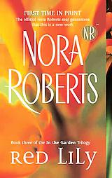
Red Lily by Nora Roberts
Both of these covers are boring, with the plain lilies on the front. The US cover, with the dominance of yellow is more striking and would attract my notice more in the bookstore. I also think it's interesting that the publisher is not using the NR seal in the UK apparently.


Predator by Patricia Cornwell
The images on both of these covers are really creepy. The old guy on the US cover is weird and anonymous looking. The wire and the polaroid on the UK cover are disturbing. Which is fitting for a mystery/thriller. The green cover of the US edition is very striking, and since so many covers are blue, it will stand out on the shelf or on a table.


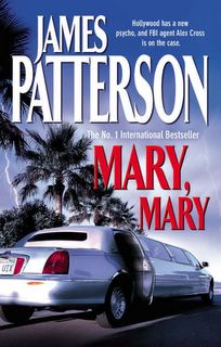
Mary, Mary by James Pattterson
I don't think there is really anything special about either of these covers. You can tell that the US cover is one designed solely for the bookstore market. The million-dollar patterson name is large and in white print on a dark background, and the title is very large so that the devoted bestseller readers will notice that it is a new title. The UK cover is one that I can imagine somebody asking for, saying "it's a blue cover with a car on the front" which could describe any number of books.


The Kite Runner by Khaled Hosseini
This one has been a huge book club book here, so I was curious about the UK book cover. I wonder if it has been such a fad read there? Anyway, very different feel to the covers here. I think the US cover emphasizes that this story takes place in a third-world nation with the city pictured on the front, where the UK cover focuses more on the boy who is one of the main characters.


2 comments:
Although Nora Roberts is a familiar name, she's not that well known in the UK, hence lack of the NR stamp. She's a name you see a lot but it holds no influence. That's the difference between the US and the UK, I think, where NR is concerned.
S'funny but, on average, I like the UK covers better - particularly for The Kiterunner and Predator. UK covers seem a bit more immediate than the American for some reason. More close-ups? I don't know.
Post a Comment